
Choosing the right colour palette for your home can completely change how a room looks and feels. But with hundreds of paint shades, furniture colours, and décor options available, deciding where to start can be overwhelming.
The beige that looked perfect in a showroom may appear completely different on your wall. A blue that looked beautiful in a Pinterest photo might feel too dark in your bedroom.
The good news is that you don’t need to be an interior designer to choose the perfect colour palette for your home.
By considering your room’s natural lighting, size, furniture, flooring, and desired mood, you can create a colour scheme that feels balanced, stylish, and personal.
In this guide, we’ll explain how to choose colours for your home, how many colours to use, how lighting affects paint colours, and the common colour mistakes you should avoid.
How to Create a Colour Palette for Your Home
Start With the Feeling You Want
Before choosing a paint colour, think about how you want the room to feel.
Do you want your living room to feel warm and welcoming? Your bedroom peaceful and relaxing? Your home office energetic and focused?
Different colours can create different visual impressions. Soft neutrals such as beige, cream, white, and light grey can create a clean and peaceful atmosphere. Warm shades such as terracotta, mustard, and earthy brown can make a room feel comfortable and inviting.
Blues and greens are popular choices when you want a calm and refreshing atmosphere, making them suitable for bedrooms, reading areas, and relaxing spaces.
You don’t have to follow strict interior-design rules. Your home should reflect your personality and lifestyle.
Choose the mood first and the colour second.
Choosing a Color Palette for Your Home
One of the most common home colour mistakes is choosing a paint shade without considering the lighting in the room.
Natural light can significantly affect how a colour appears. A shade that looks soft and warm in a showroom may appear darker in a room with limited sunlight. On the other hand, a room with large windows and plenty of natural light can make certain colours appear brighter.
Before finalising a wall colour, observe the room at different times of the day.
Look at the colour in:
- Morning light
- Afternoon sunlight
- Evening light
- Artificial lighting
If possible, test a small section of paint on the wall before painting the entire room.
For rooms with limited natural light, lighter and warmer shades can help create a more open appearance. Rooms with plenty of sunlight give you more freedom to experiment with deeper or richer colours.
Think About Each Room Separately
Your entire home doesn’t have to be exactly the same colour.
Instead, aim for a coordinated home colour scheme where each room has its own personality while still feeling connected to the rest of the house.
For example, your:
- Living room could use warm beige with wooden furniture and cream accents.
- Bedroom could introduce muted green, blue, or soft neutral tones.
- Kitchen could use white, grey, beige, or earthy shades depending on the cabinets and flooring.
- Home office could use subtle blue, green, or neutral tones for a clean and focused atmosphere.
The key is to create a visual connection between rooms.
Think of your home as one story, with each room having its own chapter.
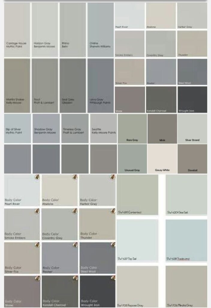
Use the 60-30-10 Colour Rule
Not sure how many colours to use in a room?
The 60-30-10 rule is a simple interior-design principle that can help you create a balanced colour palette.
- 60% — Dominant colour
- 30% — Secondary colour
- 10% — Accent colour
For example, you could use light beige on most of the walls, wooden furniture and curtains as the secondary colour, and deep green or rust through cushions, artwork, or decorative accessories.
This approach helps prevent a room from becoming visually overwhelming while still giving it personality.
You don’t have to follow the percentages perfectly. Think of the 60-30-10 rule as a starting point rather then formula
Create a Colour Palette for Your Home Before You Buy Paint”
Here’s a simple way to avoid unnecessary spending: choose your wall colour around your existing furniture instead of choosing furniture around your wall colour.
Imagine buying a sofa you love and then discovering that its colour clashes with the walls.
Before choosing paint, look at your:
- Sofa and chairs
- Curtains
- Rugs
- Flooring
- Cabinets
- Artwork
- Decorative accessories
If your furniture already has strong colours or patterns, neutral wall colours can create balance.
If your furniture is simple and neutral, you have more freedom to introduce colour through the walls, artwork, rugs, or accessories.
A successful interior doesn’t make one element stand out randomly. It makes every element work together.
Don’t Underestimate Neutral Colours
When people hear the word “neutral,” they sometimes imagine plain white walls and an empty-looking room.
But neutral colours can be incredibly elegant.
Popular neutral shades include:
- Cream
- Beige
- Taupe
- Warm grey
- Sand
- Off-white
These colours create a sophisticated base that allows furniture, lighting, artwork, and textures to stand out.
You can also combine different neutral shades instead of using only one. Layering beige, cream, taupe, and warm grey through walls, upholstery, curtains, and décor can add depth without making the room feel too busy.
The secret isn’t avoiding colour. It’s knowing how to layer it.
Add Personality With Accent Colours
Want to experiment with bold colours without committing to an entire wall?
Start small.
An accent chair, cushion, artwork, curtain, rug, or decorative accessory can introduce colour without changing the entire room.
For example, a neutral living room can become more interesting with small touches of:
- Olive green
- Navy blue
- Terracotta
- Mustard
- Rust
- Deep brown
Accent colours are also easy to replace when your decorating style changes.
This makes them a practical way to experiment with colour without repainting an entire room.
Consider the Size of the Room
Colour can influence how spacious a room feels.
Lighter colours generally create a sense of openness, which can be particularly useful in smaller rooms. Deeper colours can create a cosy and dramatic atmosphere when used thoughtfully.
However, don’t assume that small rooms always need white walls.
A carefully selected darker colour can make a small bedroom, study, or reading corner feel intimate and sophisticated.
The goal isn’t simply to make every room look bigger.
The goal is to create the atmosphere that works best for that particular space.
Avoid Choosing Too Many Colours
Sometimes, less really is more.
Using too many unrelated colours can make an interior feel visually confusing. Instead of choosing every shade you like, select a few colours that complement one another.
A simple home colour palette could include:
One main colour + one supporting colour + one or two accent colours.
You can introduce variety through textures and materials instead of adding more colours.
Wood, glass, metal, fabric, stone, and plants can all add visual interest while keeping the colour scheme cohesive.
Consider Flooring and Other Fixed Elements
Your walls aren’t the only part of the colour scheme.
Before choosing a paint colour, consider the colours that are already difficult or expensive to change, such as:
- Flooring
- Kitchen cabinets
- Countertops
- Tiles
- Doors
- Large furniture
- Built-in storage
For example, warm wooden flooring may work beautifully with cream, beige, terracotta, or earthy colours. Cooler flooring may pair better with certain grey, blue, or green shades.
Your paint colour should complement the elements that are already in the room.
Create a Colour Palette Before You Buy Paint
One of the easiest ways to avoid expensive mistakes is to create your colour palette before purchasing paint or décor.
Start by collecting inspiration from:
- Interior-design websites
- Magazines
- Furniture stores
- Paint samples
- Rooms you already love
Then identify the colours that appear repeatedly.
Once you have a shortlist, test samples in your actual room.
Remember that colours displayed on a phone or computer screen may not look exactly the same in real life.
Always judge the final colour in your own space and lighting.
Common Home Colour Mistakes to Avoid
Choosing colours becomes much easier when you know what not to do.
Here are some common mistakes to avoid:
Choosing Paint Before Furniture
If your furniture is already purchased, select a wall colour that complements it rather than creating a clash.
Ignoring Lighting
Natural and artificial lighting can change how paint colours appear throughout the day.
Using Too Many Colours
Too many unrelated shades can make a room feel chaotic rather than cohesive.
Copying a Pinterest Room Exactly
An inspiration image can give you ideas, but your room has different lighting, dimensions, furniture, and flooring.
Skipping Paint Samples
Always test a colour before committing to the entire wall.
Making Every Room Identical
Different rooms can have different personalities while still sharing a few connecting colours.
Always Look at the Bigger Picture
A colour never exists on its own.
The same shade can look completely different depending on the lighting, flooring, furniture, room size, and surrounding colours.
That’s why choosing a colour palette should be part of your overall interior-design plan rather than an isolated decision.
Take your time. Collect inspiration. Look at physical samples. Observe your existing furniture and lighting.
Most importantly:
Don’t choose a colour simply because it looks good in a picture. Choose it because it works in your actual space.
When Should You Consider Professional Interior Design Help?
Sometimes the hardest part isn’t choosing a colour. It’s knowing which colours will actually work together in your specific space.
Professional interior planning can help coordinate your:
- Wall colours
- Furniture
- Lighting
- Flooring
- Curtains
- Décor
- Materials and textures
An experienced interior designer can also help you avoid costly mistakes and create a colour palette that suits your space, lifestyle, and personal style.
Professional guidance can be particularly useful if you’re renovating an entire home or trying to coordinate several rooms.
Final Thoughts
Choosing the right colour palette for your home is about much more than selecting your favourite shade.
It’s about understanding your space, considering natural and artificial lighting, coordinating furniture and décor, and creating an atmosphere that feels right for you.
Whether you prefer warm neutrals, calming greens, elegant blues, earthy tones, or bold accent colours, the right combination can completely transform your home.
So before you pick up that paint chart, look at the whole room—not just the wall.
A well-planned colour palette can bring every element of a room together and turn an ordinary space into one that truly feels like home.